Case Study
Wanda
A cash-pay rideshare product for seniors and their caregivers, built on the driver network of a Medicare/Medicaid transportation business.
Company — MTM/Veyo
A cash-pay rideshare product for seniors and their caregivers, built on the driver network of a Medicare/Medicaid transportation business.
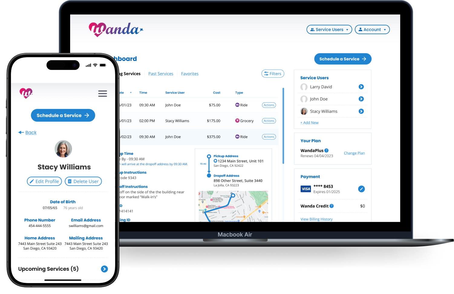
I worked on Wanda while at MTM/Veyo, a transportation company specializing in NEMT — non-emergency medical transportation. The core business moves people to medical appointments, pharmacy visits, dialysis treatments, and hospital discharges, and it is paid for by Medicare or Medicaid. The rider doesn't reach for a wallet, and the trip has to qualify for coverage before it happens at all.
That model is the important part of the context, because Wanda was a deliberate departure from it.
Wanda was a cash-pay product. No insurance, no coverage determination, no qualifying appointment — a caregiver or a senior paid out of pocket for a ride, the way anyone pays for an Uber. For a company whose entire revenue ran through Medicare and Medicaid reimbursement, that was a genuinely different business.
What made it viable was that the hard part already existed. MTM/Veyo had the fleet, the driver network, the dispatch system, and the routing logistics built and running at scale for the reimbursed side. Wanda pointed a second, paying demand side at that same infrastructure. The addressable market got substantially larger; the marginal cost of serving it was low, because nobody had to build a transportation network to find out whether the idea worked.
Once the caregiver is paying cash and comparing us to Uber on their phone, price transparency, trust, and the speed of a repeat booking stop being nice-to-have UX qualities and start being the things the business runs on, which is where my expertise came in.
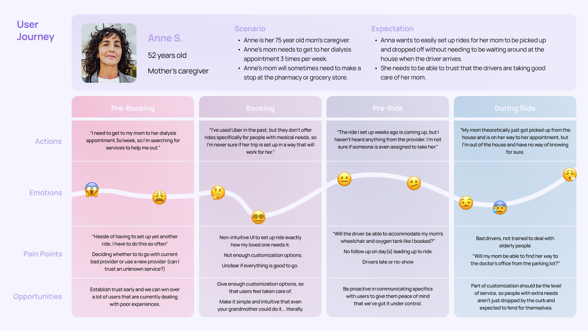
Ran the interviews with older adults and caregivers, and turned what came back into personas and journey maps. One finding from this work changed the product's primary user.
Wireframes, user flows, mockups, and the prototypes used in testing before anything went into development — across both desktop and mobile, from signup and booking through checkout and the ongoing dashboard.
A Figma component library that kept desktop and mobile consistent and gave the front-end engineers a blueprint to build against instead of one-off styles.
There is a specific trip that neither side of the existing market serves.
Mainstream rideshare treats a ride as a commodity: a car arrives, you get in. That assumption quietly fails the moment the rider uses a wheelchair, travels with an oxygen tank, or can't get from their front door to the curb unassisted. A sedan pulls up, the driver has no training and no equipment, and there is often not even physical space in the vehicle for a folded wheelchair. What happens next is an untrained stranger trying to get someone out of a chair and into a car on the side of a road.
Reimbursed NEMT handles exactly that rider well — but only for trips that qualify for coverage. A ride to a covered medical appointment is in scope. Getting to a daughter's house, a haircut, a non-covered specialist, or the grocery store is not.
So the gap is narrow and real: people who need NEMT-grade accommodation, taking trips that insurance will never pay for. That's the market Wanda was built for.
The consequence of that gap is that for this rider, a ride is not one thing you either get or don't get. It's a set of requirements that all have to be met at once, and a generic dispatch has no way to know about any of them.
A wheelchair-accessible vehicle is a different vehicle, not a preference. If the wrong car is dispatched, the trip cannot happen — there is physically nowhere to put the chair.
Assisting someone out of a wheelchair, or traveling with an oxygen tank, takes training. An untrained driver improvising at the curb is the failure mode, not an inconvenience.
Where the ride ends matters as much as whether it arrives. The curb is not the destination if the rider can't reliably get from the curb to the right room.
Very often, not the rider. The person selecting the vehicle, entering the medical details and paying is someone else entirely — which turned out to be the finding that reshaped the product.
I ran interviews across two cohorts, and it's worth being straightforward about how they were recruited, because it shapes how much weight the findings can carry.
The first cohort was reached through the team — friends, relatives and personal connections of coworkers who fell inside the target age demographic. These weren't the specific cash-pay customers we intended to sell to. They were there to give us a grounded read on the age group itself: how these people actually relate to apps, phones, and booking something online.
The second cohort was existing customers of the reimbursed Medicare/Medicaid side of the business. Their value was narrower and sharper. I wasn't asking them whether they'd pay cash for a ride — they were on the covered side, so that question wasn't theirs to answer. I was asking whether the product and the interface made sense to someone who actually takes these trips.
Between the two, we had reasonable coverage of the demographic and of the usability question.
We went in suspecting this and came out certain. Most of the people I spoke with weren't familiar with app conventions that a younger user never consciously registers — not just specific patterns, but the basic grammar of moving through a mobile interface. This wasn't a matter of preference or polish. It meant that anything requiring a user to hold several decisions in their head at once, or to recognize an unlabeled icon, or to understand that a screen scrolls, was going to fail.
It converted directly into hard design constraints: larger type, high-contrast and unambiguous calls to action, and a single action per screen.
This was suspected at the start and confirmed early in interviews. Many of the seniors we spoke to simply didn't manage this category of logistics themselves. An adult child, a spouse, or a professional caregiver did — the same person who manages the appointments, the pharmacy, and the paperwork.
This is the detail that broke the original plan. A caregiver managing both parents doesn't have one rider to arrange trips for; they have two, with different mobility needs, different medications, different doctors. The original design let a caregiver sign up on a rider's behalf — which technically covered it, but meant a separate account per person, and logging out of Mom's account to book something for Dad.
Once we accepted that both would use the product, it became obvious they need different things from it. A rider in the car wants to know where they are and when they'll arrive. A caregiver wants to know that the pickup happened, that the right vehicle came, and that the handoff went as arranged — often while doing something else entirely, somewhere else entirely.
The emotional low points in the journey maps weren't where I initially expected. They weren't about wait times or price. They were about a ride arriving that couldn't do the job — the sedan for the wheelchair user, the driver who doesn't know how to help, the drop-off at a curb that leaves a confused senior to find the right door alone. The fear underneath it, especially for caregivers, was of a loved one stranded or wandering.
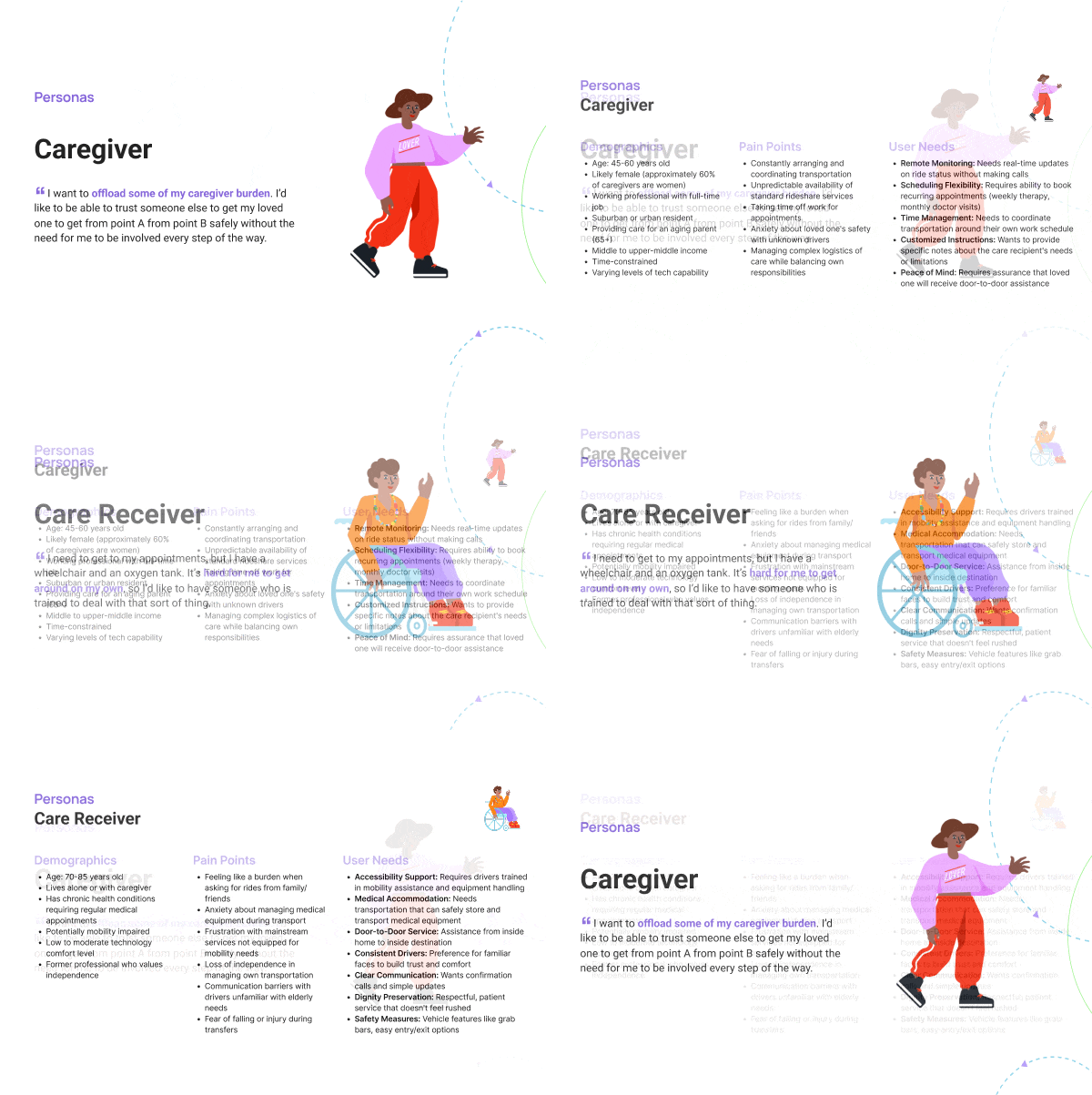
Wanda started out designed for the person in the car. Caregiver access existed as a permission: you could sign up on someone's behalf, and the product would tolerate it.
The research made that untenable. If the caregiver is usually the one booking, and often manages multiple riders, then treating them as a delegated edge case guarantees the primary workflow is the unsupported one. So we split the signup experience to facilitate this.
Signup now asks one question before anything else: are you booking for yourself, or for someone you care for? Answer "someone else" and you get a caregiver account that holds multiple rider profiles — each with its own mobility needs, accommodations, addresses, and ride history — all reachable without logging out of anything.
Both doors stayed open, deliberately. A senior comfortable with a phone can hold their own account and book their own rides; nothing about the caregiver model forces them into dependence they didn't ask for. What changed is that the caregiver path became a designed experience rather than a tolerated one.
The strongest single constraint out of research. If a screen asks for two decisions, it asks too much. This shaped the entire booking flow into a sequence of small, unambiguous steps rather than a dense configuration form.
A rider's mobility needs don't change between trips. Asking for them on every booking is both a burden and a risk of getting it wrong. Capture them once, at the rider profile, and default every future ride from there.
You don't reassure a caregiver with a promise of quality. You reassure them by letting them state exactly what's needed — this vehicle, this level of assistance, delivered to this person — and showing it back to them before they pay.
A senior booking for themselves and a caregiver booking for two parents are both first-class users. Neither should be routed through a flow designed for the other.
This is the mechanic the rest of the product hangs off, and the clearest thing that separates Wanda from booking an Uber.
On a rider's first booking, the caregiver works through the accommodations: vehicle type, mobility assistance, medical considerations like an oxygen tank, level of service at each end of the trip. It's the longest interaction in the product, and deliberately so — broken into single-decision steps rather than presented as a form.
Then it's saved to that rider's profile as their defaults. The second booking for that person starts pre-filled and takes a fraction of the time; the caregiver reviews rather than re-enters. Every subsequent ride pays back the setup cost again, and the payoff compounds per rider — which matters most for exactly the user the research surfaced, the one managing two people at once.
It also reduces a real safety risk. Re-entering mobility needs on every booking is an opportunity to forget one under time pressure. Defaults mean the wheelchair requirement is stated once, correctly, by someone who knows the answer.
Rather than one kind of ride, the caregiver chooses how far the driver's involvement reaches — at both ends of the trip, independently. Curbside is what you already get from Uber or Lyft: the car waits, you make your own way to it. Above that, the driver comes to the door and walks or wheels the rider out. Above that, the drop-off doesn't end at a curb — the rider is taken inside, into the lobby or waiting room. At the top, the rider is handed off to a named person: a receptionist, a front desk, someone who now knows they've arrived.
The most complete tier starts inside the home, with the driver helping the rider get ready before the trip begins.
Designing this as an explicit ladder rather than a checkbox mattered. It gave the caregiver a vocabulary for the thing they were actually anxious about — the pickup and the dropoff — and it let them buy exactly as much assistance as this person needs on this trip.
On the reimbursed side of the business, price is invisible to the rider — the plan settles it. On Wanda it is the caregiver's own money, spent repeatedly, on a service priced above the Uber they're mentally comparing it to. That inverts what checkout has to do.
So checkout was designed to restate the whole configuration alongside the cost: which rider, which vehicle, which level of service at pickup and at drop-off, and what each of those adds. No fee revealed late, and no ambiguity about what was booked. The premium is defensible when a caregiver can see precisely which parts of it they chose — and the same screen doubles as the last chance to catch a wrong accommodation before a driver is dispatched.
Wanda rides cost more than an Uber. For the accommodations described above, that premium was justifiable, but it collided with a hard fact about the customer: the people who need this service most are the ones who need it repeatedly, and repeated premium pricing is where cost sensitivity bites hardest.
Wanda Plus was the answer — a paid subscription returning 15% off every ride. The arithmetic is the point: at roughly three to five rides a week, depending on trip length, the discount covers the subscription and then keeps going. Below that it doesn't pay for itself, and we weren't shy that it's aimed at frequent riders.
Two things it was designed to do. First, close the gap to Uber and Lyft pricing for high-frequency riders, so the premium services stopped being the reason to go elsewhere. Second, retention: a subscriber has a standing reason to book with Wanda again, and the savings grow the more they do. It's a stickiness mechanism as much as a pricing one.
A Figma component library covering both breakpoints. Its job was less about visual polish than about making the accessibility decisions structural: if the type scale, contrast, and tap-target sizes live in shared components, then "designed for an eighty-year-old" survives contact with a dozen new screens built by people who weren't in the research sessions. It also gave the front-end engineers a blueprint to build against, so the implementation didn't drift into one-off styles.
Wanda shipped as a mobile-friendly web experience, not a native iOS or Android app. That was decided early to let the development team move fast. The cost was everything native gives you and a browser doesn't: staying signed in, being one tap away on a home screen, and the general feeling of an app rather than a website. Feedback bore this out — the interface read as clunky next to the Uber and Lyft experiences it was inevitably compared with, and no amount of design could fully compensate for that.
It's a particularly expensive tradeoff for this audience. Asking a user with low tech literacy to log in through a mobile browser every time is precisely the kind of friction the research told us to eliminate.
Live tracking — the map, the vehicle approaching, the arrival estimate that makes a rideshare feel trustworthy while you wait — wasn't built into the product. The reimbursed side of the business already had a tracking service, so we tied into that instead: the rider gets a text message with a link, and the link opens a separate web page with the map.
It works, and it was fast to do. But it means the most anxious moment in the whole experience — waiting to find out whether the right vehicle is actually coming — happens outside the product, in a page that looks like it belongs to someone else. For a caregiver whose main worry is a loved one stranded, that's the wrong moment to hand off to a system that feels third-party.
Three to five rides a week is a high bar. For the occasional rider the subscription is worse than paying per trip, which means the pricing model serves the frequent-use segment well and leaves the intermittent one facing the full premium.
Neither cohort could answer the central business question. The first was recruited through team connections for demographic insight; the second were covered Medicare/Medicaid riders, for whom cash pricing is hypothetical. The usability findings are solid. The claim that this population will pay a premium out of pocket rested on business analysis, not on my research.
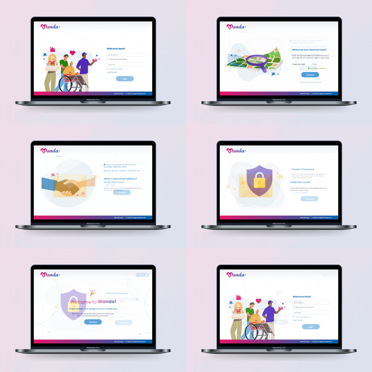
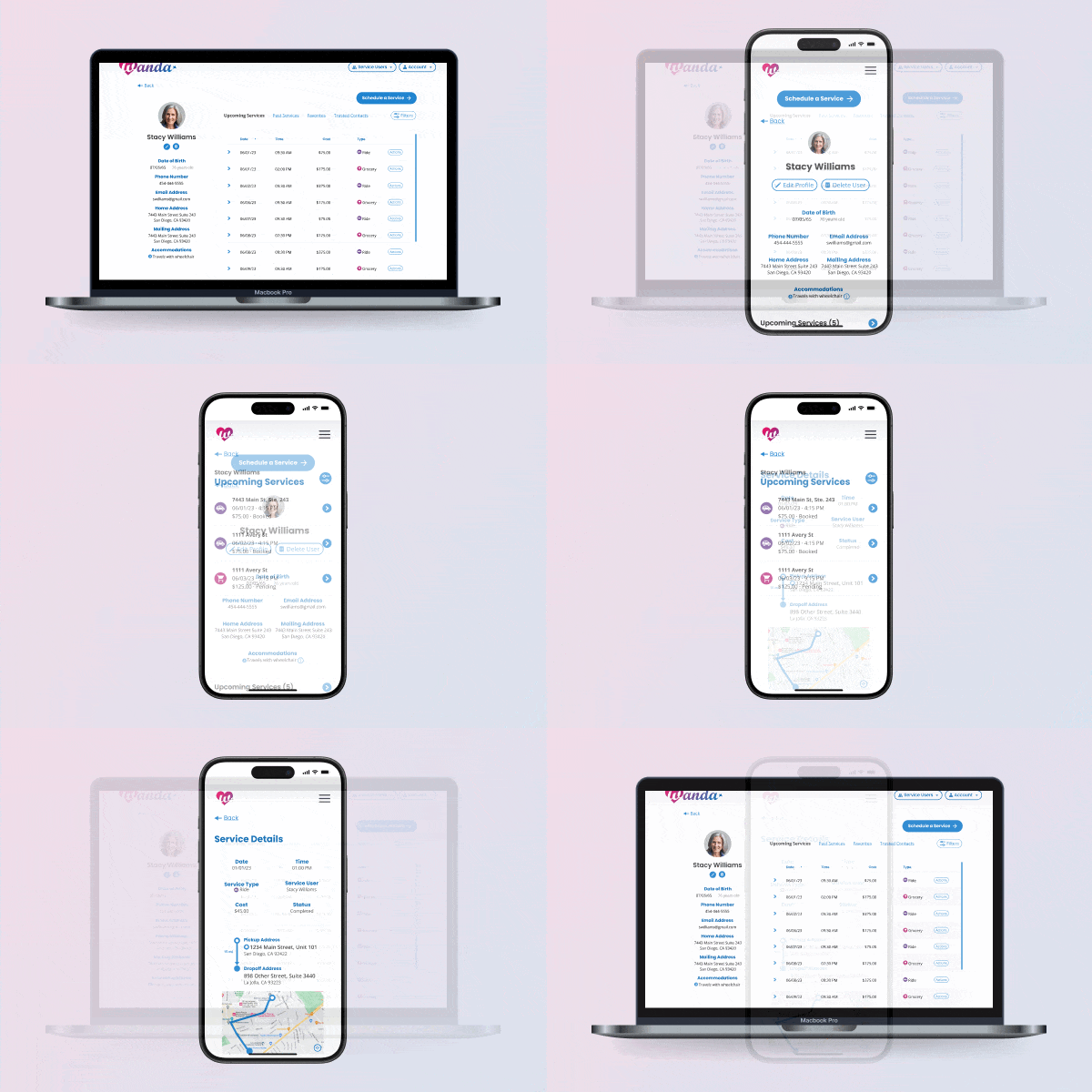
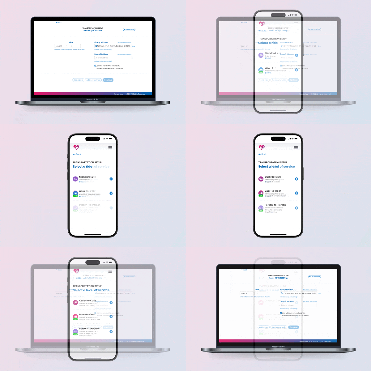
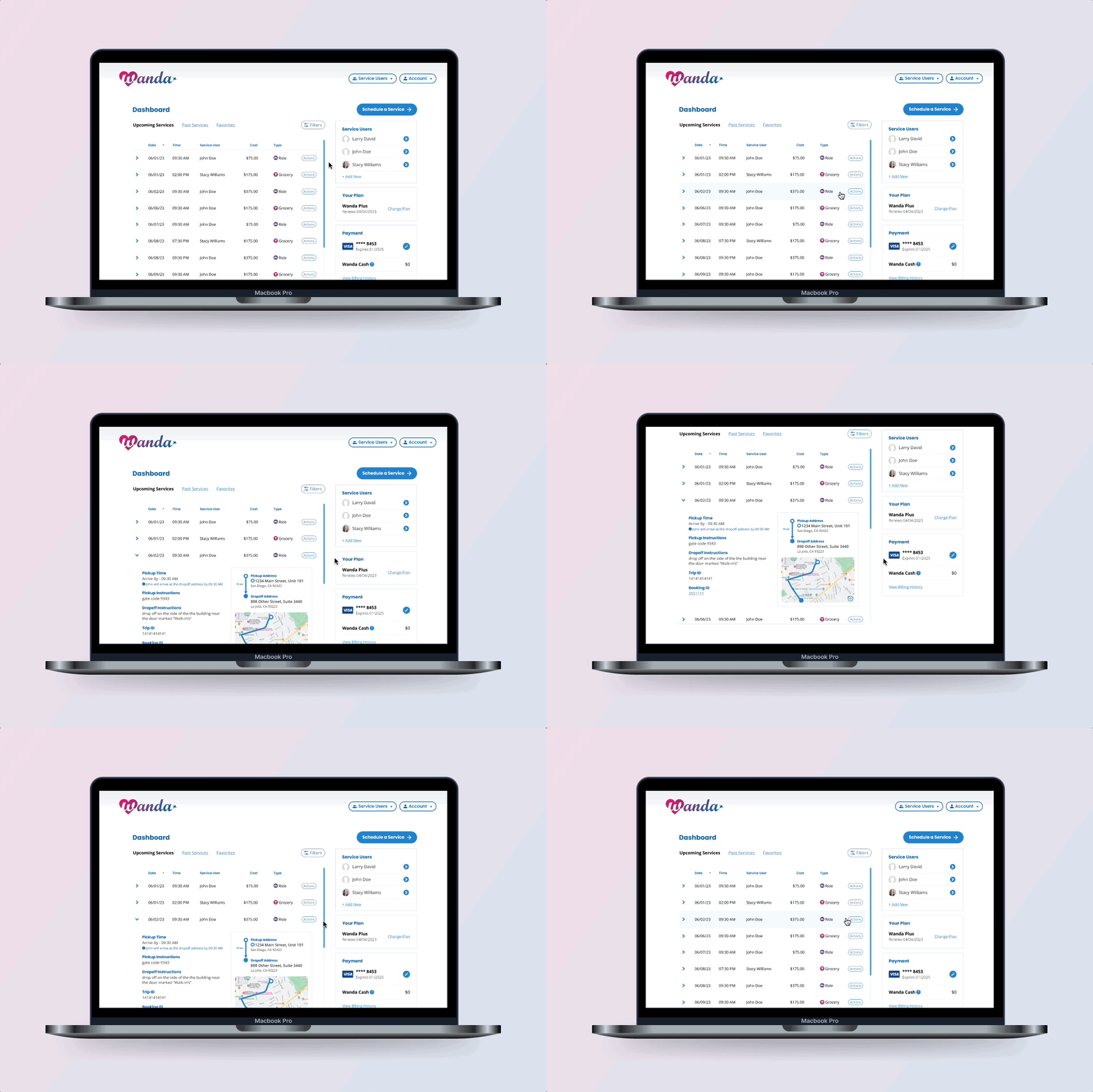
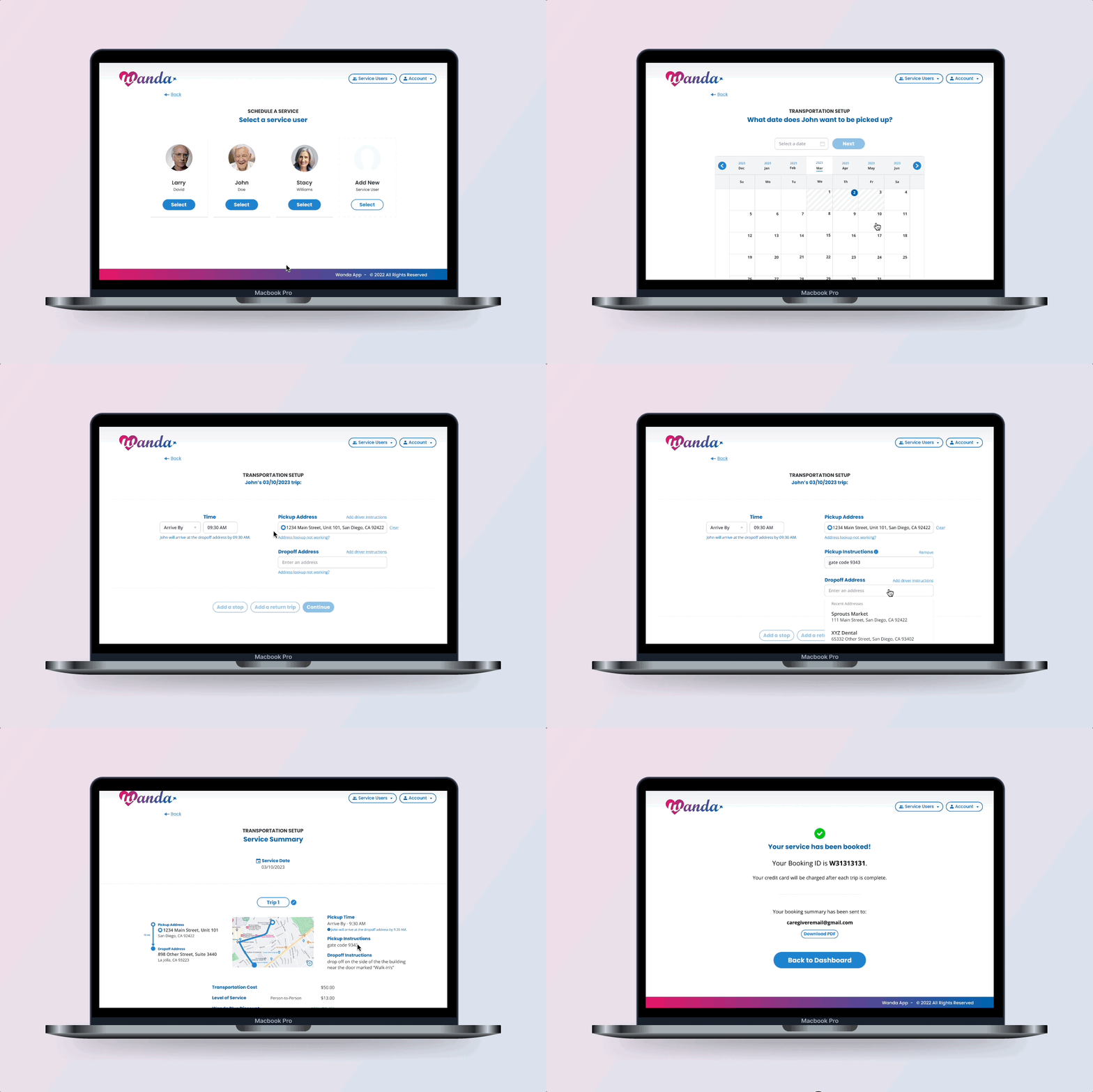
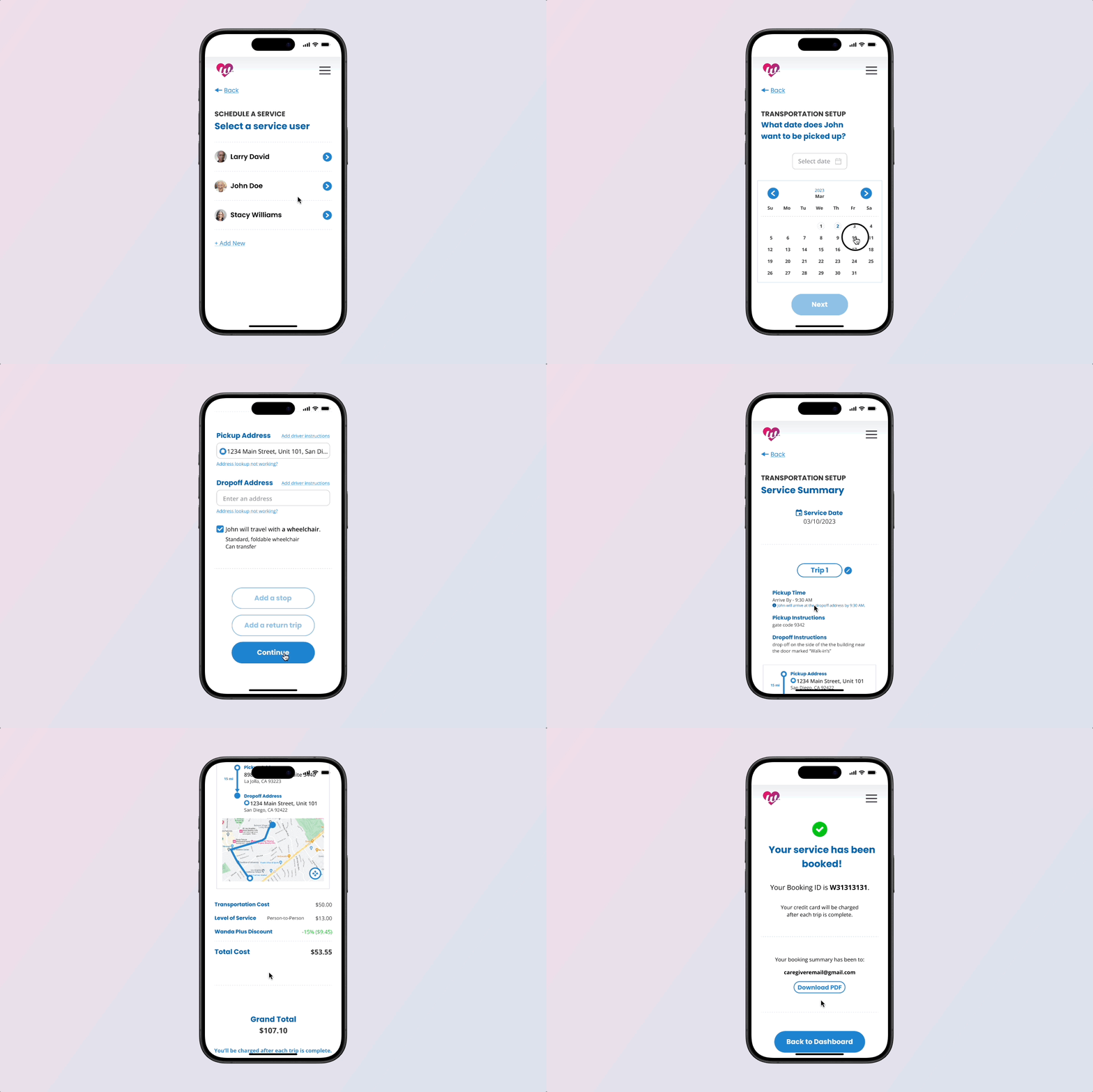
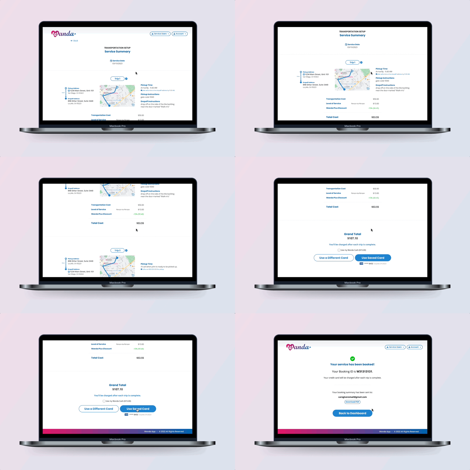
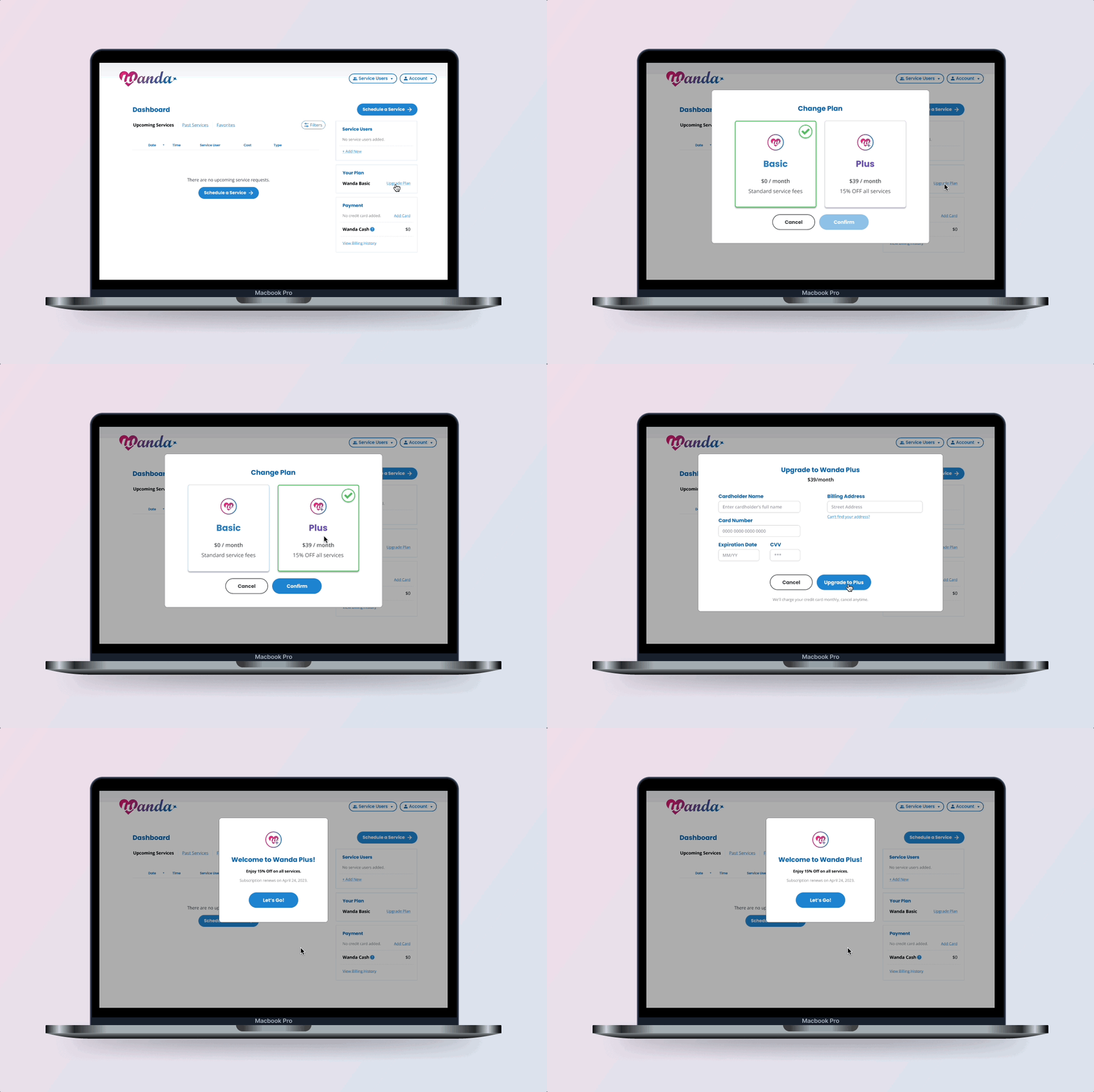
The product had a limited launch in January 2024 in Phoenix, AZ and Tucson, AZ, and early feedback suggested that riders were happy with the experience. Both markets were chosen because MTM/Veyo already had NEMT operations there, so the driver supply for a new cash-pay demand stream existed on day one.
What's next: Wanda is in a great place to expand from offering only rides to fulfilling the initial productvision of grocery and meal delivery, contractor and home services, and more, aiming to become the ultimate "everything app" for senior citizens.