Blood Test Dashboard
Modernizing blood test results for a concierge medicine clinic
Private practice and concierge medicine has been growing rapidly for the past few years. Patients are looking for more than what a traditional primary care can provide in the limited time that they have to see patients. There has also been a recent push for more of a preventative care model, so-called Medicine 3.0, rather than being focused solely on treating issues once they arise.
To support this changing field, I recently worked with a private practice doctor who runs a clinic focused on just that: preventative medicine that seeks to optimize and expand healthspan and performance.
I collaborated with the lead doctor and his clinical team to define core requirements and project scope. I planned and executed the user research that was used to uncover patient needs and inform our design direction.
From there, I drove the end-to-end design process, delivering high-fidelity mockups, an interactive prototype, and a scalable design system to support future development.
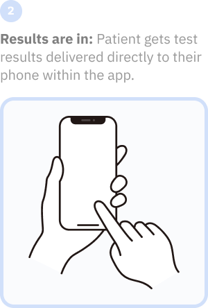
A large part of the preventative healthcare model is using biomarkers to track a patient's evolving health over time. Today, this is mostly done through blood testing. However, most blood testing facilities deliver their results in an outdated fashion, only focusing on "out of range" results, rather than honing in on optimized levels.
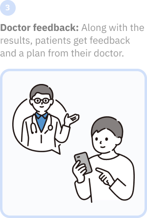
The clinician I worked with had their own "optimal" levels for many of the common blood tests, going above and beyond what the standard reference range would dictate. Existing software solutions made this hard to navigate, since they were primarily designed to diagnose sick patients, instead of as an optimization tool.
My role was to come up with a better way to display these biomarkers and blood test results, focusing on optimizing otherwise healthy individuals, while still highlighting any abnormal biomarkers.
I conducted hour-long patient interviews to understand their biomarker testing experiences, supplemented by short 10-15 minute surveys across the entire patient population to capture broader patterns and demographics at scale.
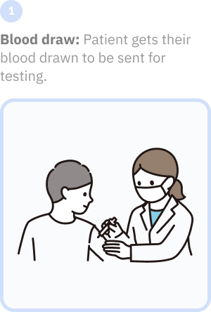
Between interviews, I went through the complete patient experience myself: from booking to blood draw to receiving results. This firsthand experience revealed the anxiety of waiting and confusion of interpreting complex reports without guidance.
Combining patient stories with personal experience created genuine empathy across our team. I wasn't designing for abstract personas anymore, I was solving problems I had felt myself.
Research Process
1
Deep dive interviews with patients:
This was my opportunity to get face-to-face with the prospective user population and have a conversation about their experiences with measuring their biomarkers, exploring what worked well and where the current process came up short.
2
Surveys sent out to patient population:
I used surveys to be able to target a much larger percentage of the clinician's patient population. This method provided much needed demographic information and a general idea of what their goals and motivations were.
3
Going through the process myself:
I have had plenty of blood work done in the past, but not with this specific provider. I went through the same process that a patient at this practice would go through to get a first-hand glimpse of the experience.
~400
Patients who filled out surveys
1
Afternoon spent getting tests
As the data started to flow in, it became clear that I'd need to talk to the clincal team again to get them on board with additional functionality. People were inundated with health information via the news and podcasts, but rather than being helpful and guiding them, these information sources resulted in them having too many options: no one knew what really worked or why.
For this new app to be successful and actually have the impact we aimed for, we'd need to not only display test results and give people a better understanding of what they meant, we'd also need to prescribe a plan of attack for people to follow that would enable people to see real change and optimize their health.
From the surveys and interviews that I conducted, a few core pain points seemed to show up over and over again, regardless of who I was talking to. These would come to serve as main pillars to orient the team around, with more nuanced pain points and user needs that were unique to specific personas being used for more fine-grained design details.
Pain Points
1
"Normal" doesn't mean optimal:
The healthcare system focuses on detecting disease rather than optimizing health, leaving everyone frustrated with "you're not sick" instead of "here's how to thrive." All users need biomarker interpretation that goes beyond standard reference ranges to provide optimization targets for peak performance and longevity.
2
Information overload without actionable insights:
Users are drowning in health data, but starving for meaningful guidance - they have lab results, wearable data, and symptom tracking, but can't connect the dots. Everyone needs complex health information translated into clear, personalized action steps that they can actually follow.
3
Lack of time in healthcare interactions:
Whether it's busy professionals needing quick insights, parents juggling family responsibilities, or doctors wanting efficient consultations, everyone is constrained by insufficient time. All users need healthcare tools that deliver value efficiently within real-world time constraints rather than adding to their already overwhelming schedules.
The team used personas throughout the project to guide design decisions, prioritize features, and build empathy for the patients who would be using the app.
Our personas consisted of 4 different patient archetypes, which we used to facilitate discussions about our users' needs, goals, and varying contexts of use. The personas were discussed with the clinical team to develop a clear picture of who the design would target in the MVP release of the app.
I also created a persona for the doctor, whose workflow would be impacted by this new app.
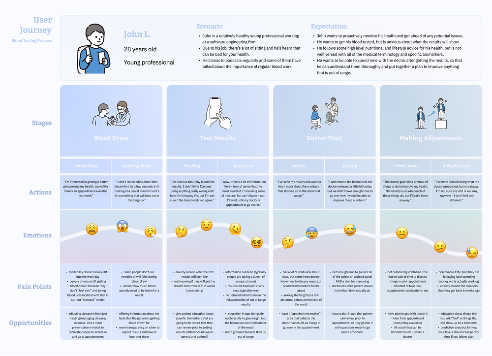
I used user journeys to visualize and communicate the users' end‐to‐end experience across various touchpoints with the app. This allowed me to represent user pain points and see where I should focus my attention during the design phase.
Mapping out the users' emotions as they moved through the experience was key to setting client expectations about the aspirational emotional state I was aiming to design for.
Now that preliminary research had been completed and distilled down into a few core findings, I translated those learnings into product requirements that the app would need to satisy in order to effectively solve our original problem of providing test results in a digestible way that was easy to understand and that was actionable.
To do this, there were 3 main functional areas that needed to be addressed:
Recieve & Understand Results
1
Results focused on optimization:
Display biomarkers with 4 distinct ranges (abnormal, borderline, normal, optimal) instead of traditional binary normal/abnormal, with personalized explanations of what each result means for the user's specific demographics, health goals, and risk factors.
2
Integrate educational content:
Provide educational information to the patient to help them understand their results. Bonus points: have explanations that scale in complexity based on user type - from basic explanations for busy parents to detailed correlations for performance optimizers.
Make Adjustments Based on Your Plan
1
Actionable recommendations:
Generate specific, prioritized recommendations (lifestyle, supplement, medication, exercise, etc) based on individual biomarker gaps, with clear rationale for why each suggestion will impact specific lab values and overall health goals.
2
Doctor's notes:
On top of the generated recommendations, the doctor and clinical team should be able to add/edit their point of view for that particular patient.
View Trends & Improvements Over Time
1
Predictive health analytics:
Provide trend analysis that shows not just historical changes but projected trajectories, enabling early intervention before biomarkers move into concerning ranges and allowing users to see the long-term impact of their optimization efforts.
2
Visualization on multiple time horizons:
Offer flexible time-based views (3 months for hormonal cycles, 6 months for lifestyle interventions, 2+ years for aging trends) that help different personas understand their health changes in the most relevant context for their specific goals and concerns.
As much as we wanted to deliver everything our research uncovered, we didn't have the time or budget to launch with all that functionality. We needed a phased approach that front-loaded the MVP with enough core features to make a meaningful impact, but not so much complexity that we'd never ship.
This meant making hard decisions about which user needs to prioritize and which advanced features could wait.
We focused on universal pain points affecting all personas: receiving digestible lab reports, categorizing results beyond normal/abnormal ranges, showing trends over time, and providing actionable improvement plans.
This ensured our MVP would deliver immediate value, while establishing a foundation for more sophisticated features in the future, such as AI coaching, interface personalization, and a Health Score™.
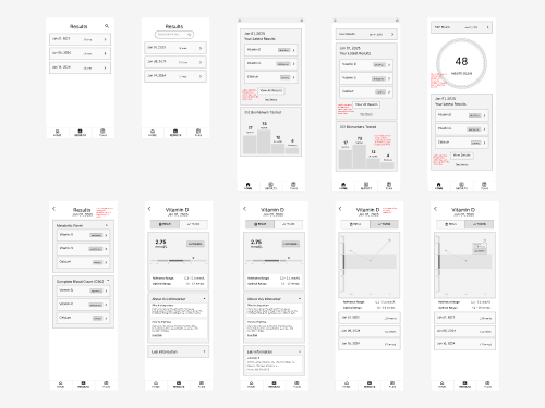
Wireframing
A general design direction began to emerge after I sufficiently tinkered with my sketches and storyboards.
I cleaned up these early concepts into a set of wireframes to continue to iterate on the design.
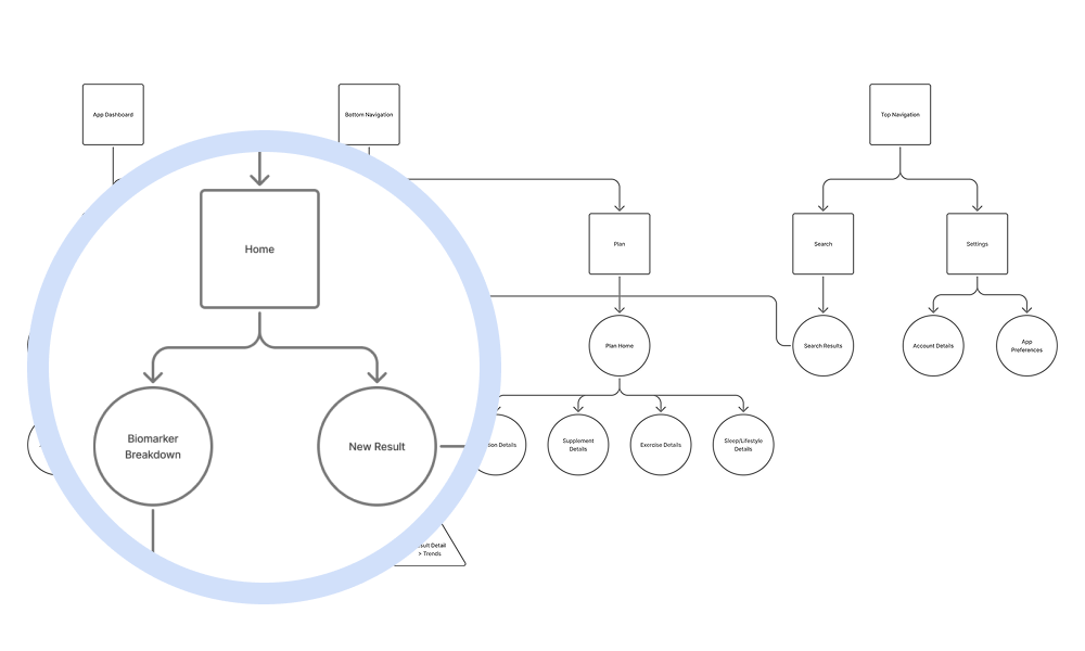
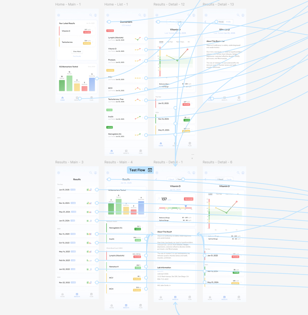
Architecture
As I wireframed more screens, I created an information architecture diagram to organize all of the different pieces and visualize how they all fit together.
The test result serves as the smallest atomic unit in the app, with every other feature and recommendation building upon this foundational element. Getting individual test results right was crucial, since users interact with dozens of these across multiple lab panels, and each needed to immediately communicate both its numeric value and contextual significance.
By using four distinct categories — Abnormal, Borderline, Normal, and Optimal — instead of traditional binary results, each atomic unit provides actionable understanding of current status and optimization potential.
Prototyping
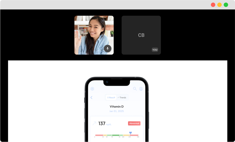
I built interactive prototypes in Figma for all of the core workflows in the app, which enabled me to get better feedback from users because the experience felt like the real thing.
User Testing
Most of the patients who were part of the initial interview/research process agreed to be part of the user testing process.
I had them run through scenarios using the prototype to gauge how effectively we were solving the original problem we set out to solve.
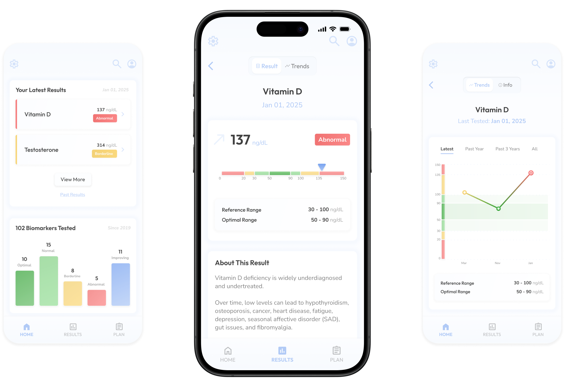
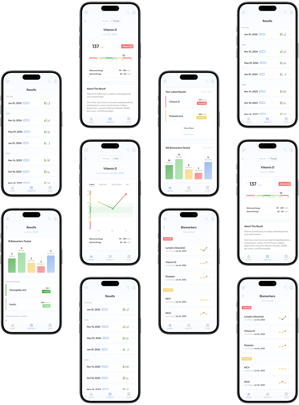
Home Screen
Surfaces the user's latest test results and high level results of all biomarkers tested historically.
From this hub, users can drill into specific test results or biomarkers for more details.
All Biomarkers
Previously tested biomarkers are grouped into categories based on their most recent result.
Trends from the latest 3 tests are shown at a glance in a mini sparkline chart.
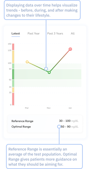
Biomarker Details
After drilling into a particular biomarker, users are shown a line graph with historical results broken into different segments based on reference ranges: Abnormal, Borderline, Normal, and Optimal.
Results List
Results are grouped based on the day that the testing sample was taken.
A mini bar graph shows a high level breakdown of the categories the test results fell into: Abnormal, Borderline, Normal, Optimal, and Improving.
Result Report
Tapping into a result in the Results List takes you to a report for that particular group of tests.
A high level bar chart displays the segments that the test results fell into.
There's also a list of every individual biomarker tested, its corresponding result value, and the category it falls in based on the reference range.
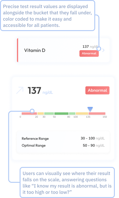
Result Details
Drilling into a specific biomarker will show more details about that particular test, including a more detailed chart showing reference and optimal ranges, and details about the biomarker and the implications of your result.
For less than optimal results, there is also a "Plan" feature to help optimize a user's values.